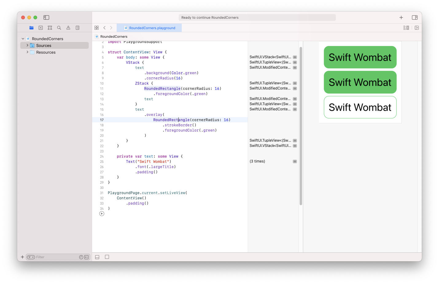
Rounded corners, like many other things in SwiftUI, can be added in few different ways. In this article, you will learn the simples one and one more sophisticated that you may find helpful in some circumstances. Let’s start.
ViewModifier

The easiest way to add rounded corners to any view is by using the cornerRadius modifier. Of course, you have to add background to see the effect of this modifier. You can achieve the example above with these five lines of code:
Text("Swift Wombat")
    .font(.largeTitle)
    .padding()
    .background(Color.green)
    .cornerRadius(16)
The cornerRadius modifier supports two parameters. The first unnamed one is radius, and the second one is antialiased, which is by default set to true.
Shape

Instead of using cornerRadius, you can create a more sophisticated view by using ZStack.
I used a similar solution to create chat bubbles.
A solution like this isn’t probably recommended to add only a background with rounded corners, but you may find it useful to start playing with advanced views. This solution begins with the RoundedRectangle shape. Since the Shape struct is also a View, you can use it as a base for your creations. Putting RoundedRectangle into ZStack, just above your given view, will create a rounded background effect.
ZStack {
    RoundedRectangle(cornerRadius: 16)
        .foregroundColor(.green)
    Text("Swift Wombat")
        .font(.largeTitle)
        .padding()
}
When creating the RoundedRectangle struct, you can provide a cornerRadius parameter.
Overlay

There is also a third solution, often used to create borders. This solution uses the overlay to display a view above another view. If you use it for the rounded background, it will cover your creation. But it will work perfectly for borders.
    Text("Swift Wombat")
        .font(.largeTitle)
        .padding()
        .overlay(
            RoundedRectangle(cornerRadius: 16)
                .strokeBorder()
                .foregroundColor(.green)
        )
