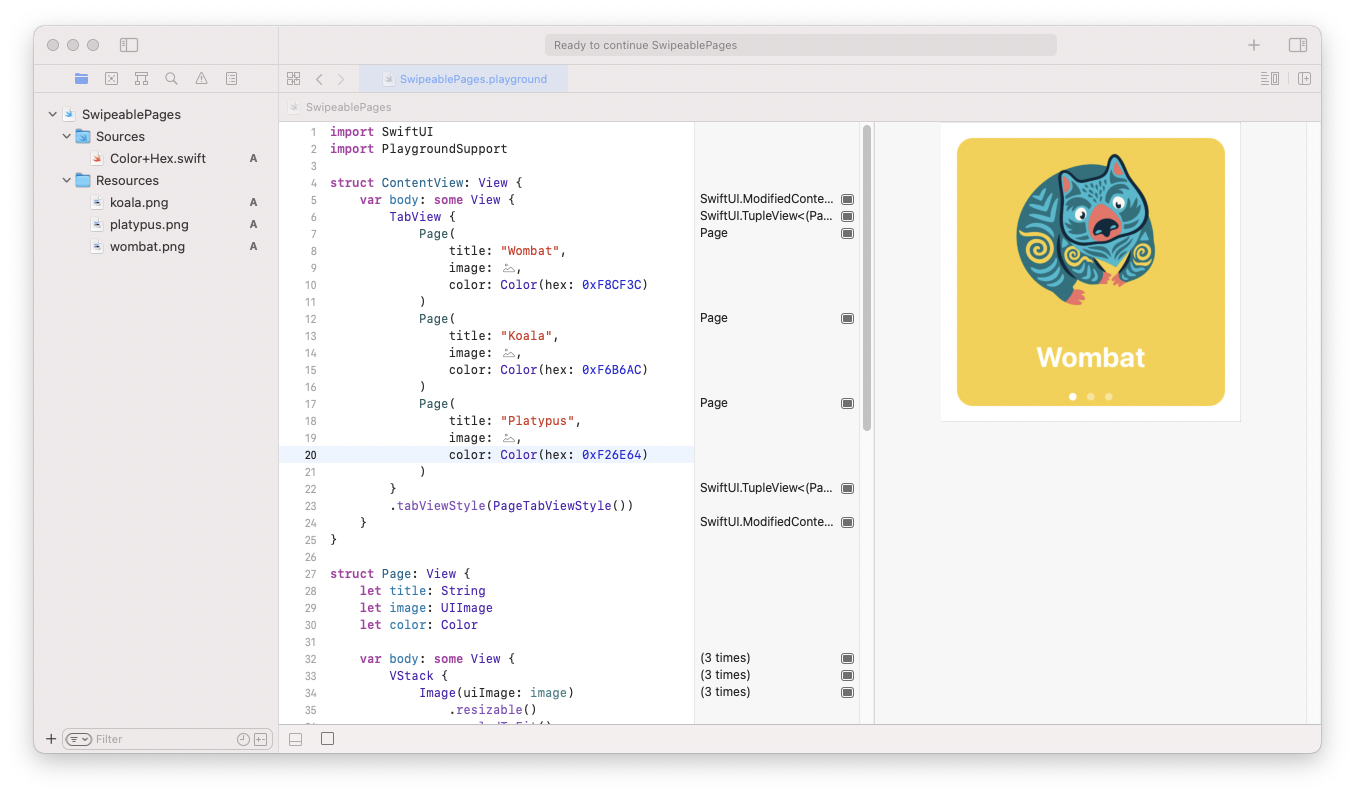
Swipeable pages, often used for application onboardings, can be easily made using SwiftUI TabView. In this tutorial, you will learn how to create a view like the one presented in the (low-quality) GIF below.

When you see TabView's name, the first you may think is a tab bar navigation like the one you can make using UITabBarController. It is its first and most common usage, but TabView can be styled to look like UIPageViewController.
TabView has a straightforward API. Basic usage of it looks like this:
TabView {
    Text("Page 1")
    Text("Page 2")
    Text("Page 3")
}
You list all tabs/pages using view builder. It’s often used with a specification of images and titles placed on the tab bar items:
TabView {
    Text("Page 1")
        .tabItem {
            Image(systemName: "1.square.fill")
            Text("Page 1")
        }
    Text("Page 2")
        .tabItem {
            Image(systemName: "2.square.fill")
            Text("Page 2")
        }
    Text("Page 3")
        .tabItem {
            Image(systemName: "3.square.fill")
            Text("Page 3")
        }
}
To change the tab bar to page view, you have to set a different style using tabViewStyle modifier:
.tabViewStyle(PageTabViewStyle())
To achieve the effect from GIF, you have to create a Page view first:
import SwiftUI

struct Page: View {
    let title: String
    let image: String
    let color: Color

    var body: some View {
        VStack {
            Image(image)
                .resizable()
                .scaledToFit()
                .padding()
            Text(title)
                .bold()
                .font(.title)
                .foregroundColor(.white)
                .padding(.bottom, 32)
        }
        .frame(maxWidth: .infinity, maxHeight: .infinity)
        .background(color)
        .cornerRadius(16)
        .padding()
    }
}
and then configure TabView as follow:
import SwiftUI

struct ContentView: View {
    var body: some View {
        TabView {
            Page(
                title: "Wombat",
                image: "wombat",
                color: Color(hex: 0xF8CF3C)
            )
            Page(
                title: "Koala",
                image: "koala",
                color: Color(hex: 0xF6B6AC)
            )
            Page(
                title: "Platypus",
                image: "platypus",
                color: Color(hex: 0xF26E64)
            )
        }
        .tabViewStyle(PageTabViewStyle())
    }
}
