A SwiftUI Picker view is a control that lets you pick a value from a set of options. The Picker will adjust its looks to the context (different for iOS, macOS, or watchOS). It can look like the UIKit component called a UISegmentedControl (or segmented control) with proper configuration.

You can use segmented control to switch a given screen’s content, for example, on filters or a list of items. Read further to find out how to display Picker in segmented control style and track element changes using @State property wrapper.
The Picker requires a Label or String, Binding that will be set when an option is selected, and content - a list of options. Segmented control style won’t display the label, but you should still provide it for accessibility. Simple picker configuration will look like this:
Picker("Selected section:", selection: /* Binding */) {
    Group {
        Text("All")
        Text("Favorites")
        Text("Recommended")
    }
}
You can use the @State property wrapper to use the SwiftUI build-in mechanism which refreshes your UI when the Picker changes. a state variable will keep selected item. A dollar sign $ before a name of variable returns Binding required for the view.
@State private var selectedSection = "all"

var body: some View {
    Picker("Selected section:", selection: $selectedSection) {
        Group {
            Text("All")
                .tag("all")
            Text("Favorites")
                .tag("favorites")
           Text("Recommended")
                .tag("recommended")
        }
    }
}
A tag modifier is used by a Picker to know which value is selected.
When you work with pickers using enums should be your first choice. You can modify the code above to make it more readable and easier to maintain.
enum Section: String, Identifiable, CaseIterable {
    case all, favorites, recommended

    var displayName: String { rawValue.capitalized }

    var id: String { self.rawValue }
}

@State private var selectedSection = Section.all

var body: some View {
    Picker("Selected section:", selection: $selectedSection) {
        ForEach(Section.allCases) { section in
            Text(section.displayName)
                .tag(section)
        }
    }
}
That way, when you add a new element to an enum, it will be automatically added to the list.
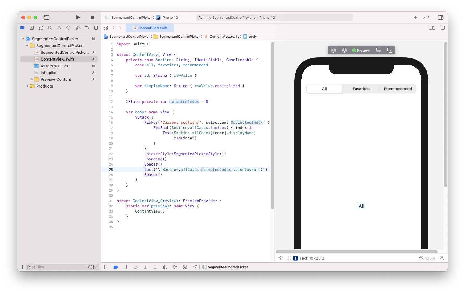
There is one point of this puzzle missing. Picker supports pickerStyle modifier. To achieve a UISegmentedControl style, you have to provide SegmentedPickerStyle value to it. You can find the full, ready to use code below:
import SwiftUI

struct ContentView: View {
    private enum Section: String, Identifiable, CaseIterable {
        case all, favorites, recommended

        var displayName: String { rawValue.capitalized }

        var id: String { self.rawValue }
    }

    @State private var selectedSection = Section.all

    var body: some View {
        VStack {
            Picker("Selected section:", selection: $selectedSection) {
                ForEach(Section.allCases) { section in
                    Text(section.displayName)
                        .tag(section)
                }
            }
            .pickerStyle(SegmentedPickerStyle())
            .padding()
            Spacer()
            Text("\(selectedSection.displayName)")
            Spacer()
        }
    }
}