If you are an iOS or macOS user, you have seen alerts many times. Alerts are components that inform you about some errors or ask about some destructive actions. It would be best if you were careful not to overuse them in your app because it may distract users.
SwiftUI offers a structure that makes displaying alerts very easy, but you must remember two limitations:
-
Due to the nature of SwiftUI, you must specify your alerts as an element of the view’s tree. You will expect that displaying an alert should be a function, but it will be imperative programming. In the declarative paradigm, you specify the whole interface before the app starts. Messages displayed to users must also conform to that rule.
-
You will add alerts as view modifiers. If you add two of them at the same level, the second one will override the first. In that case, it’s better to create an enum that will combine all alerts that you want to present or, as you will see in the example below, add alerts somewhere lower the view’s tree.
With that two limitations in mind, you can go to the fun part - implementation. Alerts are added to the view’s tree at the beginning, so they need some Binding, usually a @State that will tell they should be displayed or not.
Simple Alert View Modifier
There are two versions of the alert(...) view modifier. The first one expects a boolean value that represents isPresented state of alert. You modify your state, setting it true to display it.
struct SimpleAlert: View {
    @State private var showAlert = false

    var body: some View {
        Button("Show alert") {
            showAlert = true
        }
        .alert(isPresented: $showAlert) {
            // Alert view
        }
    }
}
One thing is worth noticing. You need to use $ before the name of your @State variable to get Binding<Bool> from it.
The content block of the alert(..) modifier expects an Alert view. Its initializers look like this:
public init(
    title: Text,
    message: Text? = nil,
    dismissButton: Alert.Button? = nil
)
public init(
    title: Text,
    message: Text? = nil,
    primaryButton: Alert.Button,
    secondaryButton: Alert.Button
)
You can use the first one for simple confirmation messages (like error or info messages). Only title Text view is required for this one. By default, it displays an OK button.
The second one gives you more freedom. You must set a primaryButton and a secondaryButton for it. You can select from cancel(...), default(...) and destructive(...) button styles. System calls primary button when the view is dismissed, so watch out to not set any destructive action there.
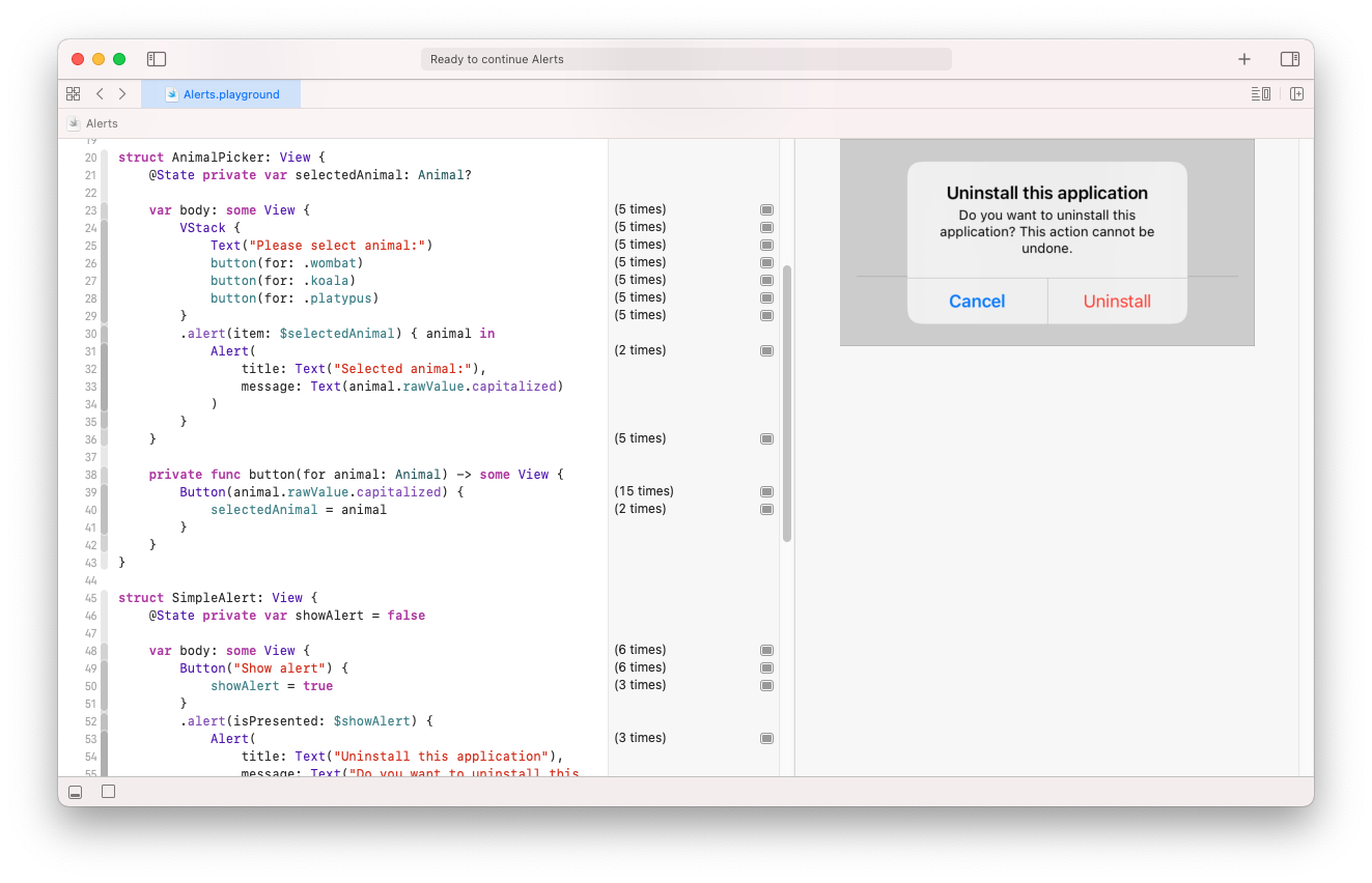
Alert(
    title: Text("Uninstall this application"),
    message: Text("Do you want to uninstall this application? This action cannot be undone."),
    primaryButton: .cancel(),
    secondaryButton: .destructive(
        Text("Uninstall"),
        action: { /* do something */ }
    )
)
You don’t have to worry about setting showAlert to false again. SwiftUI will handle this for you. The cancel button is empty in this example.
Full code to display simple alert look like this:
struct SimpleAlert: View {
    @State private var showAlert = false

    var body: some View {
        Button("Show alert") {
            showAlert = true
        }
        .alert(isPresented: $showAlert) {
            Alert(
                title: Text("Uninstall this application"),
                message: Text("Do you want to uninstall this application? This action cannot be undone."),
                primaryButton: .cancel(),
                secondaryButton: .destructive(
                    Text("Uninstall"),
                    action: { /* do something */ }
                )
            )
        }
    }
}
Advance Alert View Modifier
The second version of alert(...) can be used when the Alert state depends on the property bound to it. Instead of isPresented, you provide binding to an optional item - a struct, class, or enum that conforms to Identifiable protocol.
enum Animal: String, CaseIterable, Identifiable {
    case wombat, koala, platypus

    var id: String { rawValue }
}

struct AnimalPicker: View {
    @State private var selectedAnimal: Animal?

    var body: some View {
        VStack {
            Text("Please select an animal:")
            button(for: .wombat)
            button(for: .koala)
            button(for: .platypus)
        }
        .alert(item: $selectedAnimal) { animal in
            Alert(
                title: Text("Selected animal:"),
                message: Text(animal.rawValue.capitalized)
            )
        }
    }

    private func button(for animal: Animal) -> some View {
        Button(animal.rawValue.capitalized) {
            selectedAnimal = animal
        }
    }
}
Content block of that version of the view modifier the same as the previous one expects Alert view, but it provides you a selected item. When the selected item is nil alert is not displayed. But when you set it to an existing object, the Alert view will show. When the message is dismissed, the selected item is set back to nil.