Button, as one of the most common UI elements, is used for versatile sets of actions. But actions can have a different level of importance. Sometimes you want to highlight the primary activity or mark the destructive one in red. You can do this by wrapping the Button view in a custom view, but SwiftUI creators design a better way by using buttonStyle(_:) view modifier.
The buttonStyle modifier accepts one argument, which is an object that implements the PrimitiveButtonStyle protocol. There are some predefined structs that you can use out of the box - DefaultButtonStyle, PlainButtonStyle, and BorderlessButtonStyle. To use them, call:
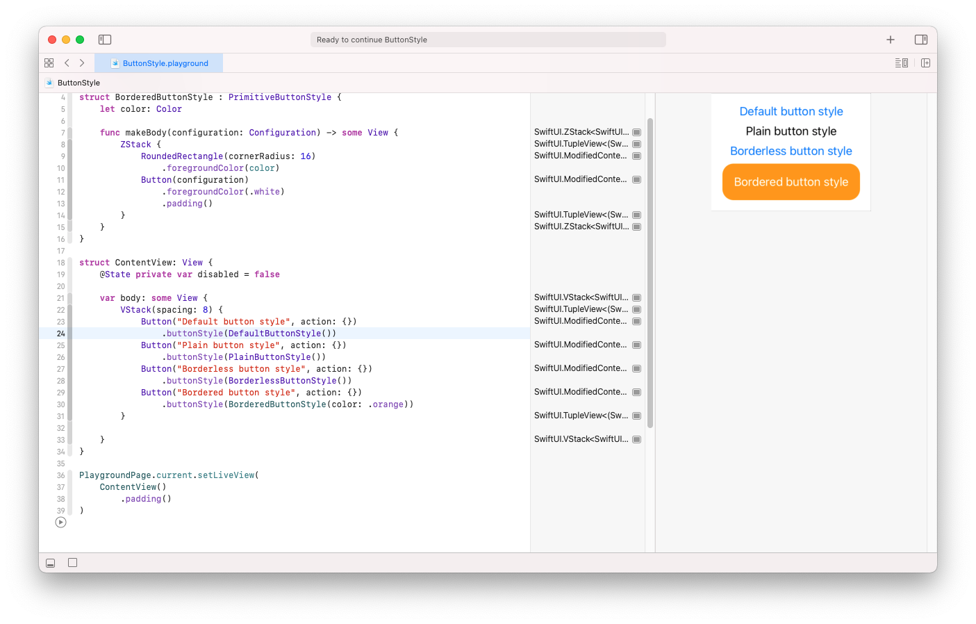
Button("Default button style", action: {})
    .buttonStyle(DefaultButtonStyle())

Button("Plain button style", action: {})
    .buttonStyle(PlainButtonStyle())

Button("Borderless button style", action: {})
    .buttonStyle(BorderlessButtonStyle())
You can look at the bottom of the article to find out how they look on iOS. But that styles adjust to the platform. They will look different on iOS, watchOS, and macOS.
Those are still minimal options. But you don’t have to stop here. Create your struct, implement PrimitiveButtonStyle protocol, which requires only one makeBody(configuration: Configuration) -> some View method, and you can create as many styles as you want.
The makeBody function is responsible for creating a button, so usually it w contains something like this Button(configuration), but you can modify the configuration or create a new one before you pass it to the Button view initializer.
In the example below, I created a button with a rounded border. Background color can be controller by the color property:
struct BorderedButtonStyle: PrimitiveButtonStyle {
    let color: Color

    func makeBody(configuration: Configuration) -> some View {
        ZStack {
            RoundedRectangle(cornerRadius: 16)
                .foregroundColor(color)
            Button(configuration)
                .foregroundColor(.white)
                .padding()
        }
    }
}
To apply the new style to the Button, use the same modifier as above:
Button("Bordered button style", action: {})
    .buttonStyle(BorderedButtonStyle(color: .orange))
Custom button styles can be a straightforward solution to prepare a tailored set of button styles dedicated to your app.